The Maastricht UMC+ Case
The Maastricht UMC+ Case is one of the bigger commissions: a multi year commission that started with an in depth survey into, and advice about, its vision, mission and strategy. It resulted in myself designing the new brand and logo, and complete corporate identity—a package of epic proportions. Again a fun team effort with dear friend and Over & Beyond team mate Emiel van der Wal.
Maastricht UMC+ is unique because it combines the role of a university hospital (UMC stands for University Medical Center) with that of a major regional hospital and serves not only Limburg but also parts of Belgium and Germany. It has built an international reputation in prevention, epidemiology, cardiovascular disease, imaging, and health innovation.
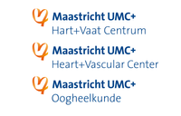
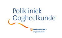
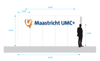
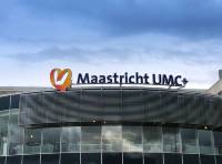
Brand design and logo of the Maastricht UMC+ by Jan Martin Wilschut BNO. By incorporating a heart in MUMC+’s logo, we added emotion to the brand. It symbolizes the passion its employees bring to their work and their dedication to caring for people. The heart is formed from the letters MUMC+ in a ribbon shape, serving as a connecting element as shown below.
Click on any image to enlarge it or view them all as a slide show.